Inside Terri & Sandy’s rebrand—and what repositioning can do for an indie
What happens to an agency when its larger-than-life founders begin to step aside? How do you preserve the magic while building something that can thrive without them? And in a crowded indie agency landscape, how do you ensure that clients and talent understand what makes you different in the first place? Those were some of the questions facing Terri & Sandy over the past two years as the shop transitioned to a new generation of leadership.
Now, the New York agency has arrived at some answers—through a colorful visual rebrand and a repositioning built around a somewhat unlikely theme in today’s advertising industry: optimism.
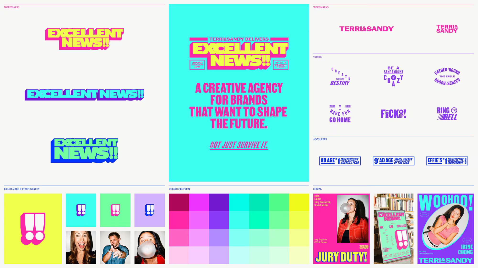
The new look, mission and website, being unveiled today, are united by the theme “Excellent News,” a phrase that’s long been a favorite expression of co-founder and CEO Sandy Greenberg. The identity is bright and maximalist, with typography inspired by New York street signs and a logo featuring two exclamation points—one for each founder.
The rebrand goes beyond aesthetics. It’s an effort to translate the personality of a founder-led agency into something more concrete that can guide its next chapter. And it illustrates how repositioning can help an indie clarify its culture, sharpen its pitch to clients and show prospective talent what makes it different.
“How you present yourself, how you’re able to talk about what you do, what your decks look like, all of that stuff matters so much,” said Amy Ferguson, Terri & Sandy’s chief creative officer. “It’s hard. But if you can’t do it for yourself, how are you going to do it for them?”
Finding the ‘excellent news’
The rebrand comes as Terri & Sandy, founded in 2010, moves beyond the leadership of its two namesakes. Greenberg remains CEO, but co-founder Terri Meyer retired in 2024. The agency is now largely run by Ferguson, who joined a year ago; Peyton Sutton, president; and John Gibson, chief strategy officer.
For Ferguson, the first challenge was articulating what made Terri & Sandy special—something people could sense about the agency, but had never quite been able to put into words.
“There’s something magical here, but I can’t quite put my finger on it,” Ferguson recalled people saying about the shop. “We have to pull the magic out so everybody can see it, everybody can feel it, and we can codify it.”
As the repositioning work began, two qualities kept rising to the top: optimism and effectiveness. The agency has a history of delivering measurable business results—it’s won Effies for clients including Freshpet, Gerber and Orchard Valley Harvest—but effectiveness alone didn’t feel like the most inspiring rallying cry.
“Obviously you want your work to work, but ‘effective’ isn’t necessarily the most exciting word,” Ferguson said.
The breakthrough came with Greenberg’s phrase, which she tends to utter whenever something good happens at the agency. Ferguson noticed it when she started working at Terri & Sandy, thinking it might look good on a T-shirt, but it came to take on a bigger meaning during the rebrand. Rather than defining the agency by its process or creative philosophy, Ferguson said, Terri & Sandy could define itself by what it delivers: news worth celebrating.
“If you look at the industry, we’re always two months away from collapse. There’s negativity everywhere, all the time,” she said. “I think there’s something kind of badass in saying, ‘No, our work is going to work. We are going to deliver excellent news.’”
With the effectiveness credentials to back it up, the optimism can feel grounded and less like naivete, Ferguson added. “Optimism for optimism’s sake doesn’t really do anything,” she said. “But optimism that’s pointed at a problem and convinced it can find the solution can be pretty powerful.”
That thinking carries through to the agency’s new website, which frames its campaigns around the business results they delivered. It’s one way Terri & Sandy is putting the “Excellent News” promise into practice, using its own positioning to sharpen how it sells its work.
Terri & Sandy’s new visual identity
The visual identity brings the agency’s focus on optimism to life through radiant colors, oversized typography and expressive graphics. Working with designer Sean O’Brien, founder of independent creative studio Slwnstdy, Terri & Sandy has expanded its longtime magenta palette to include electric blues, greens, yellows and purples.
The typography draws inspiration from New York signage, posters and old-school journalism, lending a distinctly local character. “We were proudly established in New York City. But also, we’re just New York City. We have no plans to go anywhere else,” Ferguson said. “I felt like that was a piece we could turn up a little bit, the New York City history and swagger.”
O’Brien spent a few weeks interviewing employees and absorbing the culture. When he and Ferguson independently developed their first mood boards, they landed in quite similar territory.
“The optimism, the energy, the maximalism,” Ferguson said. “I didn’t have the exact layouts in my head, but then he started building it, and I was like, ‘Yes. This.’”
One of the most distinctive design elements is also one of the simplest: a pair of exclamation points as a standalone brand mark. Appearing on agency merch including hats, it instantly communicates enthusiasm and also serves as a tribute to the two founders.
“It feels fresh. It feels like it has an opinion. It’s fun. It has that optimism,” said Ferguson.
An identity for a new generation
The rebrand also reflects how much the agency has changed since it was founded. While it built its reputation on consumer packaged goods, the agency now works with a broader mix of brands facing different creative challenges. (Its current client roster includes Princess Cruises, National Geographic and Mars.)
The goal, Ferguson said, was to find the intersection between the founders’ original vision and the ambitions of the new leadership team, without losing the qualities that made the agency successful.
“I wanted to find the Venn diagram of who Terri and Sandy were, who I am, who Peyton and Gibs are, and the kind of place we want to make,” she said. “I wanted to find that sweet center.”
The rebrand also serves an internal purpose. After a period of leadership flux, it gives employees something to rally around and a clearer sense of the agency’s identity and direction.
“I think people want to feel like, ‘Fuck yeah, that’s where I work,’” Ferguson said.